

Overview
Vente is a meetup app that helps people find local events, meetups, and activities tailored to their interests. Over the course of six weeks, my challenge was to create the app designs for Vente including logo design, high-fidelity mockups, and a responsive marketing website. I was given a set of UX artifacts, including a persona and mid-fidelity wireframes.
This was a student project, and I worked on all deliverables as an individual.
Deliverables
Mood boards
Style tiles
Wireframes
High-fidelity mockups
Prototypes
Responsive marketing website
Tools - Sketch, After Effects, InVision
Timeframe - 5 weeks

The Challenge
Today’s saturated space confines people to endlessly search through activities and events that would fit one’s schedule and travel. Vente explores this situation to provide a more pressure-free and simple approach.
User Personas
Our personas are Amy and Nate, two young professionals living in urban areas. They are both active and want to stay up to date with local events.

During the day Amy is a project manager at a small tech startup. When she is not working, she loves to explore the city, attend local events, and maintain a healthy lifestyle.
GOALS
To stay active and up to date
MOTIVATIONS
Have fun and stay healthy
FUSTRATIONS
Lack of time to search of local events

Nate writes for a popular local magazine. The city scene is his home and passion. He loves writing about the community, music, ongoing events, and health.
GOALS
Aware of local classes, events, and meet ups
MOTIVATIONS
Stay current with the local scene
FUSTRATIONS
Too much happening at once locally
Market Landscape
To better understand the meetup app space, I conducted a visual competitive analysis of six other events and meetup companies. I created an affinity diagram and saw three broad categories emerge in terms of how companies approached their brand and voice.
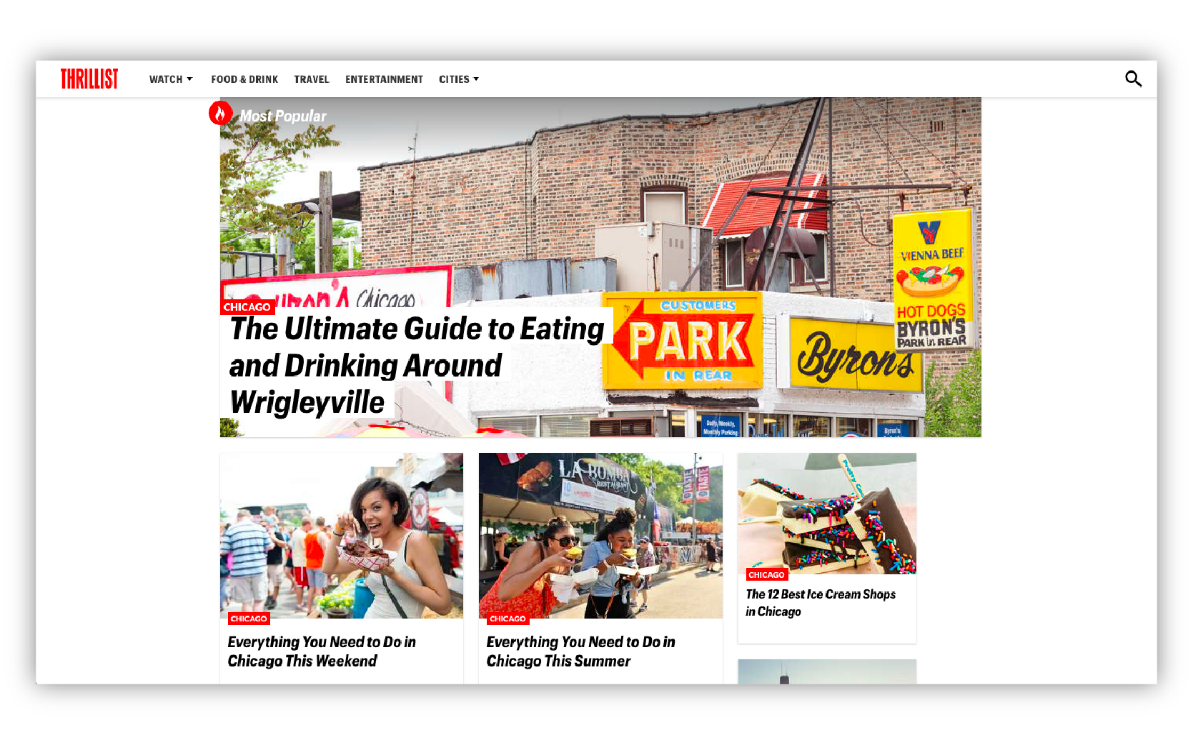
Thrillist and Do312 use heavy weight fonts and photos to showcase event listings. The bold color blocking makes for visually appealing and eye-catching graphics. Quirky illustrations can be utilized for a more quirky feel.


Eventbrite and Meetup help busy users make the search for events faster with filters and access to compare events in a list. The use of photography in banners with welcoming copy helps get users excited for their search.
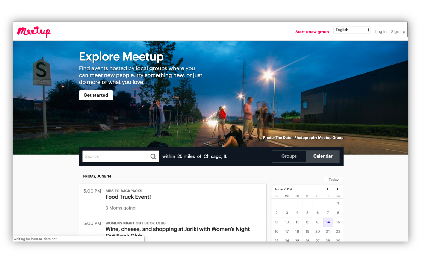

Built In Chicago and Facebook are straightforward in showing event information. When the information is thoughtfully organized, the legibility makes content digestible for the user to screen through events.

Key Considerations

MATCH TIMING
Ease search with sensitivity to time

FUN FOCUSED
Align user’s interests with event filters

IN THE NOW
Update users with current trends
Logo Exploration
1. Organized + Pen & Paper
The V in Vente uses pens as symbols for organization and the tools people use to plan and organize events in a physical space.
2. Communicate + Statement
Based on socialization and gathering of people in events, the two exclamation points stand for interaction and making a statement in conversations.
3. Curious + Paper Plane
The concept stems from the feeling of curiosity and how users find events based on interests. Main symbol is a paper plane with shapes of a heart and a compass arrow.
4. Explore + Paper Plane
With similar values from the third logo, this logo plays on the V in Vente and the perspective with the paper plane.

Approved Logo
The final logo direction chosen was ”Curious + Plane” which best fit the brand values Vente wishes to evoke. Moving forward, I looked at how this logo can support the overall design direction with color as I worked on style tiles.
Design Directions
Bold Graphics
Looking into print design and pop art, Bold Graphics is here to make a statement that is to have fun and be different. Shades of primary colors make for a playful and friendly feeling. While the outlined graphics make for a quirky and smart aesthetic.

2. Vital Elements
Inspired by the BauHaus movement, Vital Elements looks to those inspirations to help the busy user get event information is a simple and classic way. Utilizing shades of grey and one main salmon color; Vital Elements brings impact with a minimalistic approach.

3. Pastel Jewels
Defined by soft pastels, gradient fills, rounded corners, and colorized treated photography. Pastel Jewels is soft but trendy with color visuals that can standstill as artistic, soothing, and playful. It elevates the feeling of magic and how wonderful the interaction can potentially be.

Approved Direction
The final design direction chosen was ”Bold Graphics” as it was the concept that best meet the user’s needs and product feel. The finalized color palette was simplified into two bold colors, and one purple-toned dark grey. The style tile was used as a tool for further ideation.

Hex #2F3241
RGB (47, 50, 65)

Hex #76D2EB
RGB (118, 210, 235)

Hex #FFD201
RGB (255, 210, 1)
Evaluating The UX
Before jumping into the first draft of mockups, I evaluated the wireframes we had received to better understand the intended functionality and the UI elements that would help define the experience. I realized the wireframes had not been user-tested, and I could redesign the wireframes with new screens that could expand the product. Below is the original wireframe flow evaluated with callouts.
Revised Mock Ups
Original Wireframe
Redesigned Screen


Login
I opted from displaying the logo to allow users to connect via Facebook or Twitter. This would give the user more freedom and let them try the app. I added a link for forgotten passwords.


Onboarding User
Changed the screen to show a sign-up progress bar and moved the skip button to the top right corner.
I revised the copy to direct users on selecting interests that matter. I removed the hearts and just made the tags themselves a button.


Home
I revised the screen top navigation to filter events that fit the user’s interests, location, or more.
Users are greeted by featured events. They are curated daily based on user info and geo-location.
Another marketing banner directs users to browse events outside their interests to explore new experiences.
Event Listings
Events can be quickly filtered with tags based on dates for easy scheduling.
Content can be viewed as cards to view events visually, or list for detail comparison to optimize user’s search.

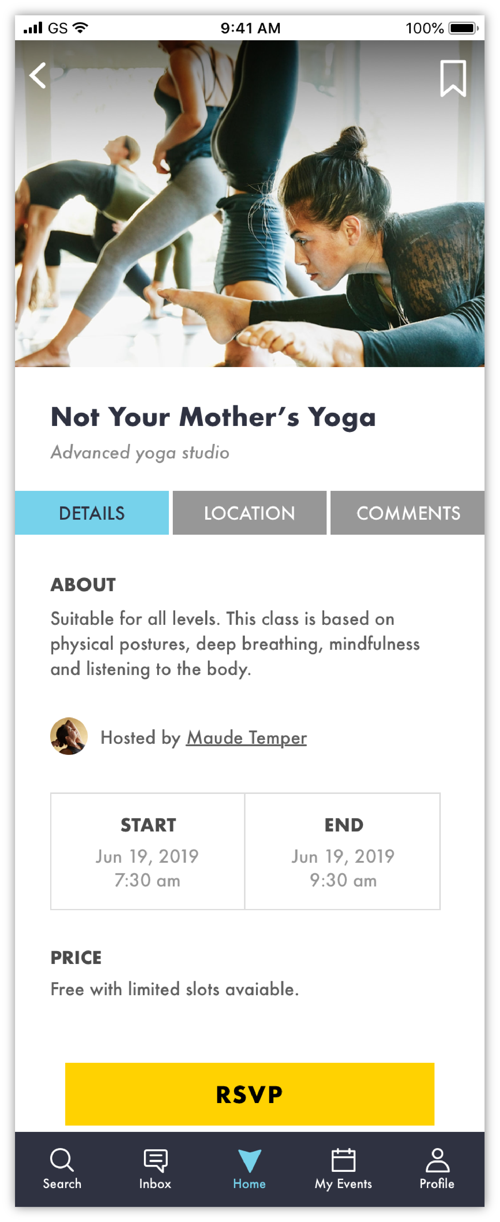
Event Details
The events feature photos reflective of the experience with the option to bookmark them in the top right corner. Changed the ‘Submit’ button to a floating ‘RSVP’ call-to-action.
Tabs break off event details for a more optimized viewing experience based on categories. Host information links to the host-user profile with a profile picture.
I added a potential pricing category since competitive brands have pricing as a filter.
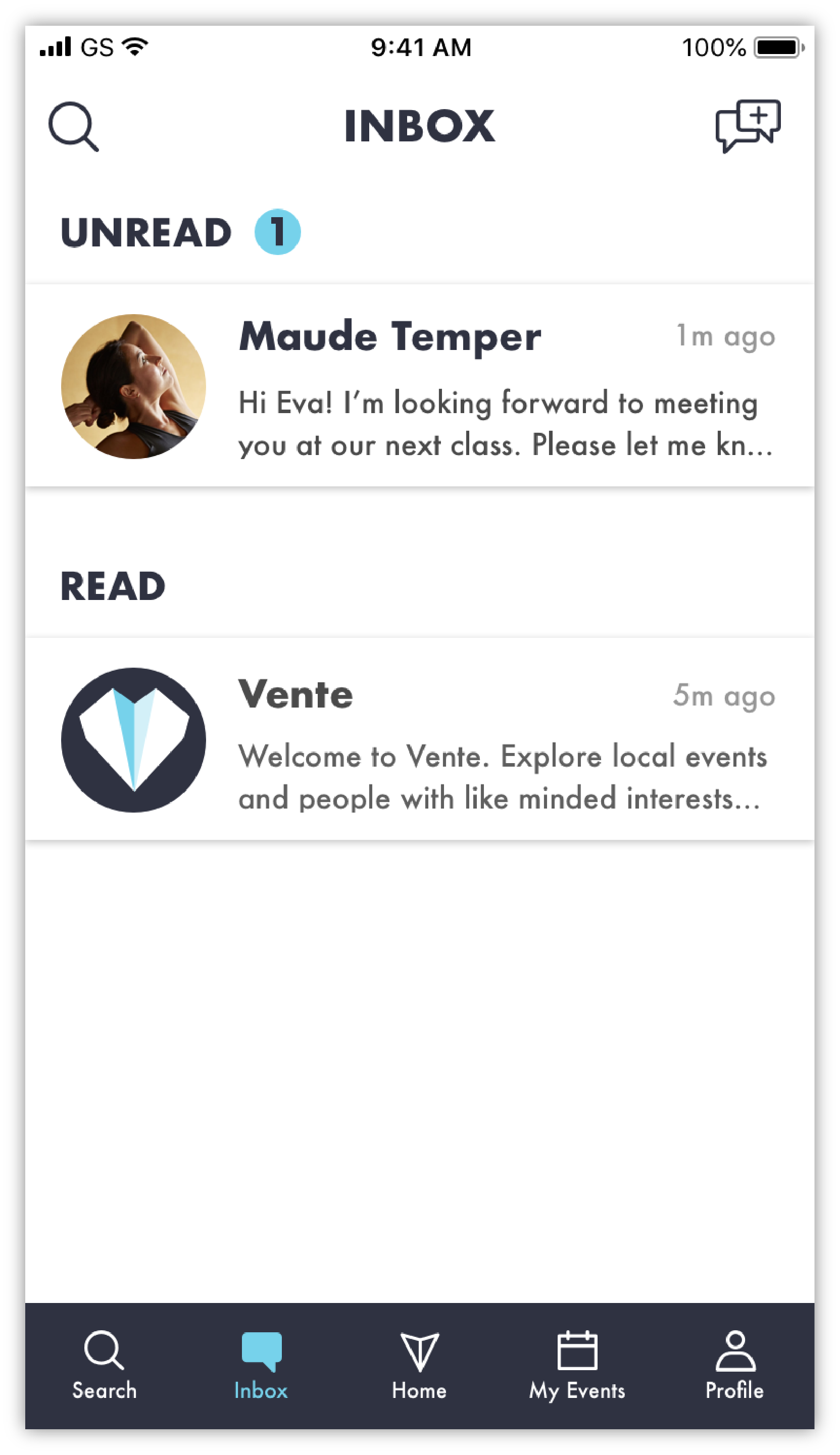
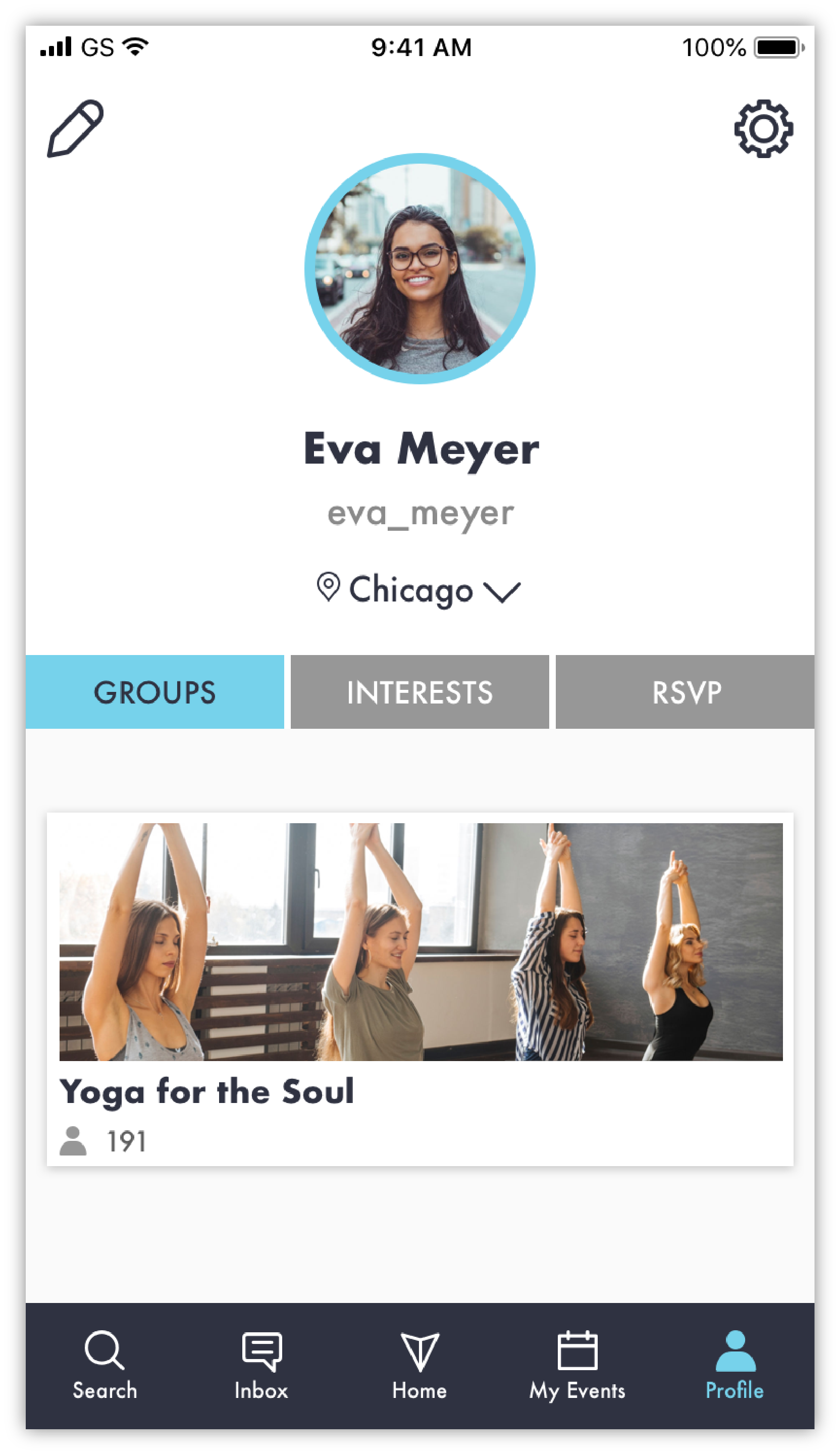
Hifi Mockups
Onboarding Flow


In-App Screens


Hi-Fi Prototype
Marketing Site
After finalizing the mobile app designs, I designed a marketing site to showcase the app with features and benefits. I drew wireframes, created on-brand illustration, chose photography, and wrote copy. View the marketing site walk-through below or through InVision.
Desktop

Mobile

Final Thoughts

Design Process
While working on this project, I realized my design process changed a bit from what I originally approached with. I gained more insights on research to better back up my design choices in execution and explaining my mock ups. I’ve become a bit more mindful about how others who would potentially view my design and what I need to communicated to make sure it’s more streamlined. I felt myself gain more sense of awareness through iterations.
The Future of Vente
Develop more on groups and how to reach users through a social aspect.
Develop more functionality for the moments when users are waiting for their events.
Think of the users who hosts events or run groups.
Continue to develop based on user testing and feedback.