

Overview
Deliverables
Visual competitive analysis
Design principles
Style tiles
Tablet app mockups
Prototype walkthrough
UI kit
Style guide
Tools - Sketch, Principle, Adobe Suite, Framer X, Keynote
Timeframe - 4 weeks
Neopenda is a medical solutions company interested in further designing a tablet application for a 4-in-1 vital signs monitoring device. Sona (CEO) and Tess (CTO) wanted to develop a high-level product within three weekly sprints in agile. The monitor provides a cost-effective solution for low-resource, high-density neonatal units in emerging markets.
Working with a design team, I delivered solutions that are clear, highly useable, and intuitive while balancing the business goals of the client and the needs of the nurses through weekly user testing.
The Medical Mission

“Sometimes it is 150 babies for you alone… it makes us ineffective. It commonly encroaches on the monitoring, because by the time you start on the first baby, when you reach the last baby you may not find the last baby surviving.”
Nearly 3 million babies die in their first month of life every year, and 98% of these deaths occur in the developing world. Current medical equipment frequently fails in low-resource facilities due to unexpected design constraints. Critically ill neonates suffer from this strain the most. Our client, Neopenda spoke to this need with a wearable accompanied by a tablet application that helps monitor a high number of patients at a glance. They came to my team at Designation to design the user interface of the application and effectively communicate criticality of multiple vitals to nurses in a high-stress environment.
What’s given?

At the starting point, we were given wireframes from a UX team that spoke to the needs of doctors and nurses in Uganda. Our priority was to further develop the application dashboard to better display the patient’s…
Pulse rate
Respiratory rate
Peripheral blood oxygen saturation
Temperature
Research
My team researched the background of Neopenda and the wireframes from the UX team. As we became more involved in developing the experience to suit the users’ needs, we noticed that parts of the application did not feel as interactive as it should be.

Wireframe Evaluation Insight
We thought more emphatically and realized that, if we have experience with using with technology daily basis and struggle to distinguish what is a button and what isn’t, then nurses from Uganda would have even more trouble interacting with unfamiliar features.
Visual Competitive Analysis

Uses sizable bold numbers in four colors to show different vitals. The dark UI makes the numbers and buttons pop.

Key colors of red, yellow, and blue for alert, warning, and normal. Also uses dark interface to make the colors pop.

With a smaller screen, numbers take up a quarter of the real estate. A dark interface with a less saturated colors.

Lighter UI with use of icons and more pastel color palette. Uses main colors of green, yellow, and red for status indicators.
We wanted to ensure that we kept Neopenda competitive when compared to the larger market space by studying other vital monitor displays. Through this visual competitive analysis, we noticed some key takeaways:
1
Traditional vital machines tend to have a dark interface in order to create contrasting colors for alertness and urgency.
2
The changing colors of vital numbers indicate if there are any abnormalities or critical changes across time and comparison.
3
Large visible text to ensure confident readability even from a distance apart the patient’s physical environment.
4
Majority of interfaces did not utilize any visual imagery or symbols which can be validated for purpose and functionality.
The First Conversation
When presenting our kick-off meeting research with Tess (Co-Found & CTO), we noted what concerns and goals she had in mind:
Client Goals

Color will need to be carefully picked to make sure criticality is expressed in context to Ugandan cultural expressions. For example, yellow is considered a royal color in Uganda and is rarely never used in medical settings.

We’ll need to balance the urgency of alarms to grab nurses’ attention but also account for alarm fatigue to make sure the interface does not take away from the main goal of the client’s product. This is the key for future validation.
This product will need to account for conditions and restrictions specific to a hospital environment: whether it is stationary, portable, or handed off from one nurse to another, it needs to be designed for the medical space.
Design Principles
To help guide our ideation, we created a set of design principles to help us ground key values in our decision-making process and final solution. These principles keep the considerations of our research, clients values, and user needs in mind.

Invert the Pyramid
Put the most important and pressing information in the most visible and prominent locations, expressing a clear hierarchy - and reducing decision fatigue.

Birds Eye View
The interface of the dashboard should make all information easily visible and assessable from a glance.

Don’t Reinvent the Wheel
Use familiar patterns, language, and conventions that don’t require learning curves, assumptions, or on-boarding to understand
Defining Visual Directions
The medical industry is heavily technical and lacks visual innovation that goes beyond something candid. Style tiles were used to show divergent ideas to users in desirability testing to quickly get an idea of what works and what doesn't.

1
Straight & Clean
The first direction is most similar to the form of the wireframes but plays with a more straightforward design. The iconography is used in tandem with text to label vitals and the patient buttons (mute alarm, patient trends, and locate). Vitals displayed use the typeface Roboto in white on color backgrounds for patient cards. The color of the background is used to communicate vital status with the default state (grey) versus the critical state (red).

2
Approachable & Friendly
The second direction reorganizes information within the patient cards. All the information is displayed on a white background while the typography of the vitals changes from the default to a critical state in red. The design is more approachable with rounded edges and forms on the sidebar play with color blocking for a more tappable appearance. The design is simplified with buttons displaying the only iconography without textual context to features.

3
Modern & Trendy
The third direction is a more experimental take on a medical interface. The overall design is a heavily dark interface with a neon-like color palette and swatches of gradients. The gradients are applied in the main call-to-action and the fill on the trend graph to show when vital ranges are stable or out of range. Patient cards rearrange information from left to right for a wider composition.
Desirability Testing
We presented a total of twelve style tiles in a randomized triading method: a total of four rounds with each round composed of three tiles for users to rate and compare. The testing revealed that Ugandan nurses prefer more vibrant colors than originally expected. There were mixed reactions to light and dark interfaces; there are benefits to light interfaces for more stimulation and dark interfaces to have colors pop. Labeling of charts and patient identification are important. So with patient buttons, it was desired to have both iconography and textual context.

We recruited 3 Ugandan users, with the help of our client, and 4 US nurses, from our personal connections. All interviews were done remotely. The feedback was surprising.
Key Style Takeaways

Card Composition
Users were drawn towards the first tile (Straight & Clean) because of the composition of the cards were familiar. The change in the vital background color to communicate a visual alarm was a strong element which resonated with users. They also thought that the first tile was the most legible from afar.

Form Follows Function
The feedback on the second tile was also strong in the sense that the rounded corners were a small but helpful way to differentiate between one card and another.

Color Condition
The third tile showed the strongest trend graph. Users really resonated with the use of color to communicate patient conditions visually.
We presented our style tiles and desirability findings with Tess. After confirming my direction to go with the first style tile based on the feedback on other successful elements, we prioritized some key screens that would be incorporated in the initial mockups.
Drawing Out Directions

Dashboard (wireframe)

Dashboard (Hi-Fi version 1)
Default Dashboard
Keeping the card formatting, my design can organize 15 buttons on the sidebar while eight patient cards are displayed at a time on the main screen.
The buttons on the sidebar are less busy. The numbers are the main visual indicator, while an outline makes it more tap friendly.
The icons from the sidebar in the original wireframes were removed. This makes the element look more like tappable buttons instead of a status bar.
The darker interface helps create a system where color is only for status awareness. For example, battery icons are color-coded for quick glancing at battery life.

Dashboard more details (wireframe)

Critical Dashboard (Hi-Fi version 1)
Critical Dashboard
The sidebar displays status labels above the patient numbers in red to emphasize the urgency.
“Warning” states have a faded red color to define the patient approaching a state of urgency.
The card that displays the vitals out of range will have a red background, while the overall card will flash and glow red to show a need for a nurse’s acknowledgment.

Add patient form (wireframe)
Add Patient form (Hi-Fi version 1)
New Patient Form
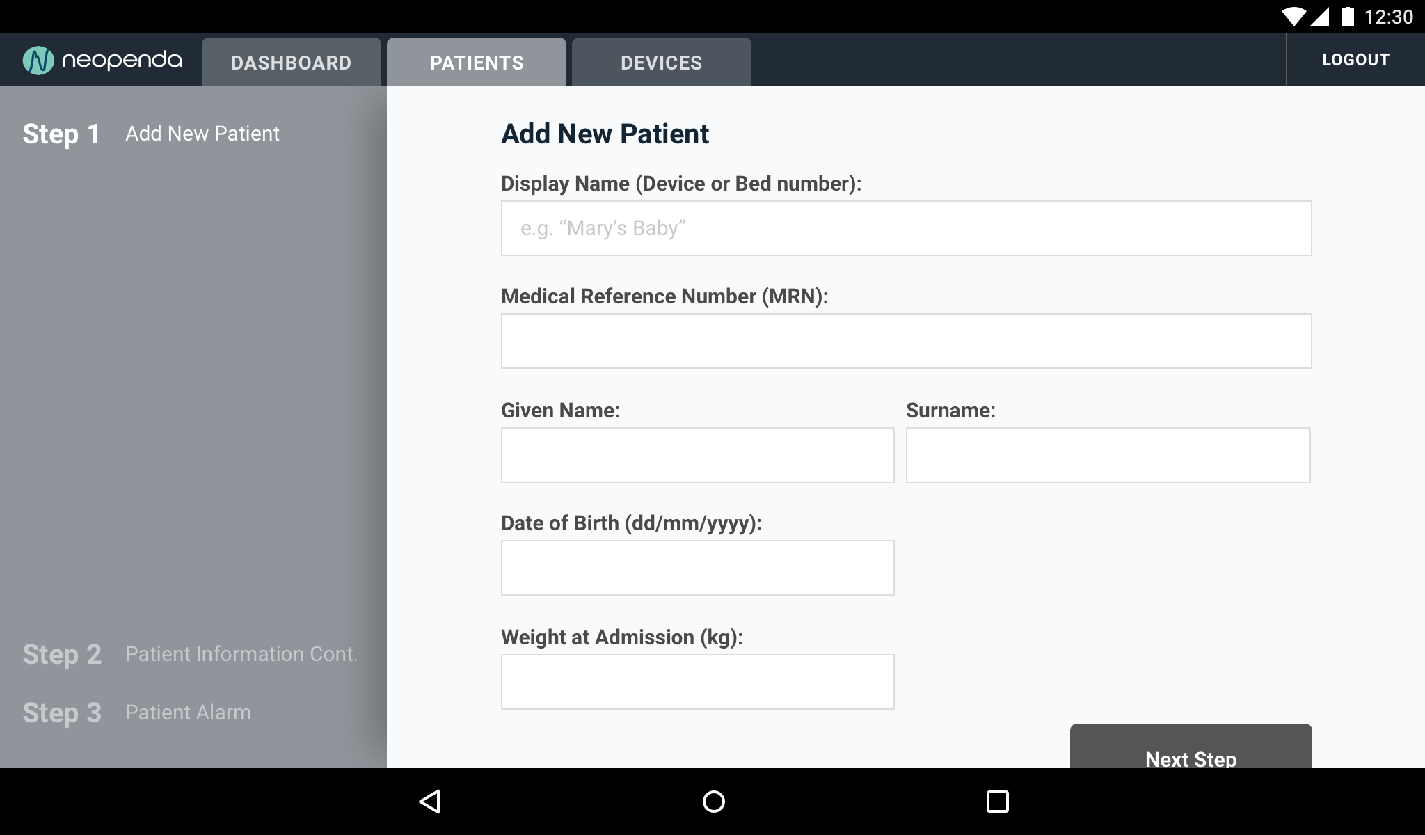
Step 1
The new patient form was pushed further to help nurses input information within a tablet on a landscape view. The sidebar indicates the progress of the form being filled out.
Information is easier to scan when there are fewer columns so when you see two column information it should relate in some sort of category. For example, here you can input a given name or a surname.
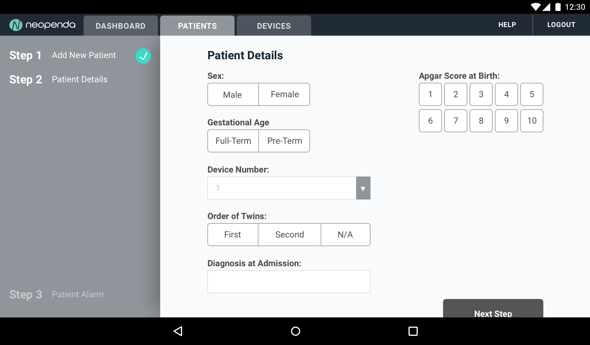
Step 2
When a step is completed, It displays a check-mark indicator.
The continued patient detail page shows more tap-friendly options. The Apgar score allows the nurse to select from buttons, whereas the devices (since there can more than ten) are displayed in a dropdown to save space without taking away from the ease of use.
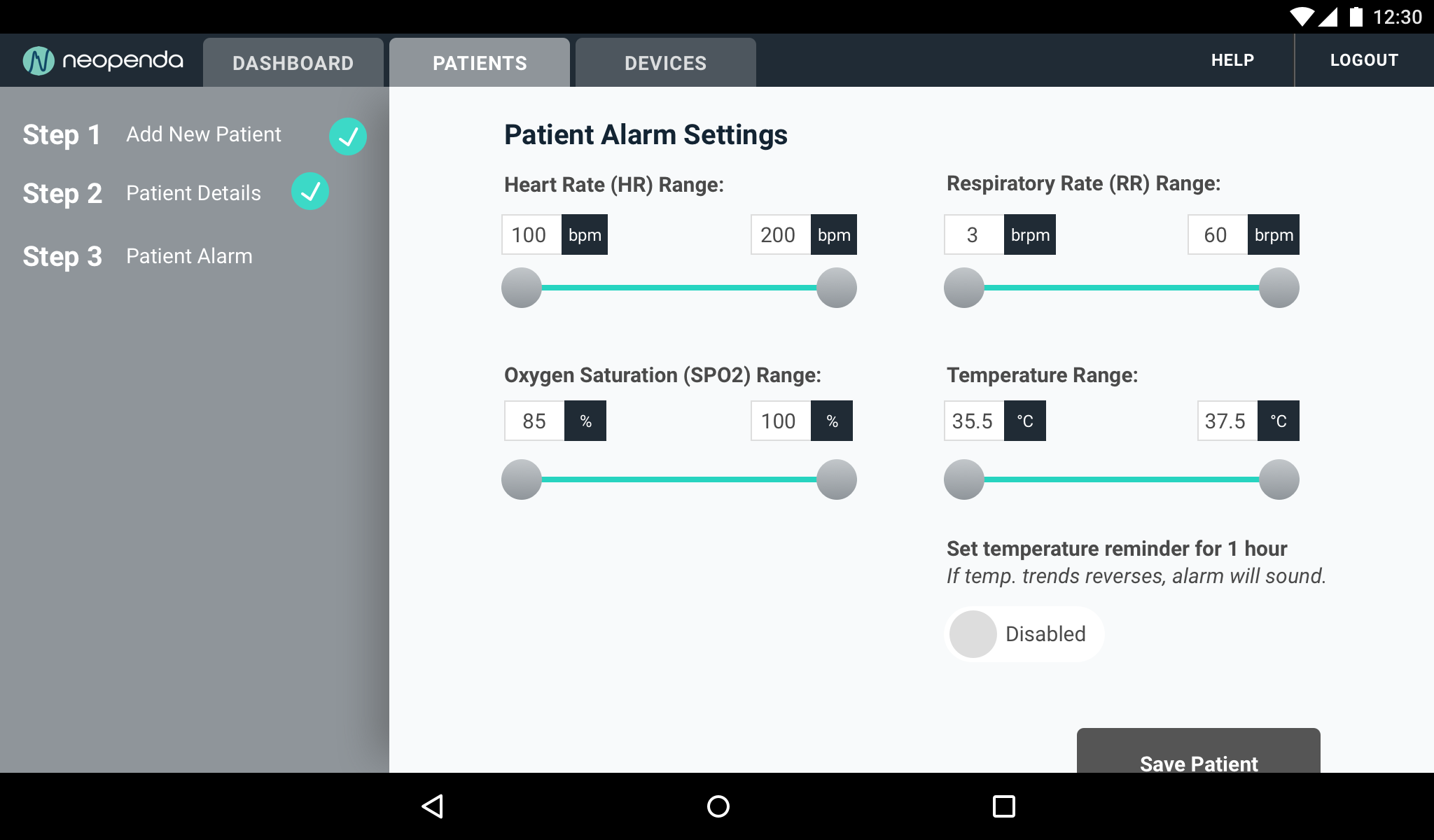
Step 3
For the final step, nurses can set ranges for the babies’ alarm settings. Here, nurses can use a slide to indicate the upper and lower bounds of the alarm system. And while the units are unchangeable, the nurses are able to type in the limits if the sliders aren’t preferred.
There’s also a toggle with a labeled indicator showing whether the alarm is disabled or enabled in green.
Finally, the “Save Patient” button would lead to a final confirmation summary screen.
Refining UX
As we jump into interaction design and build more high-fidelity designs, Our team evaluated how the nurses would react and what feedback will show when they respond to patient alarms.
New Considerations
Dashboard: Each vital determines a different alarm countdown which fluctuates the timer based on patient ranges, vital measurements, and time since birth.
Patient List: Nurses need to view patient lists in a better way that prioritize patient options and viewing information.
New Patient Summary: Allow nurses to confirm new patient information and give them the option to revise direct parts of the content.
The Solution

Default Dashboard
Nurses can reference each card effectively through the sidebar; it automatically directs and highlights the user to the specific patient.

Critical Dashboard
When patients are in critical condition, the overall card flashes with a red highlight for more attention. When muted, a countdown timer will pop up on the side to act as a timer that indicates the nurse acknowledging the patient condition.

Patient List
Patient list is reorganized and the “remove” and “archive” patient options are secondary to prevent accidental actions. Patients are highlighted when selected.

New Patient Form
Adding a new patient is broken up to three key screens. The progress is displayed with a final summary for confirmation to save the patient or go back to edit specific parts.

Patient Trend Graph
Patient trend graph can scroll horizontally to allow for an unlimited view of time duration. Graph breaks down by increments and can highlight specific data points.
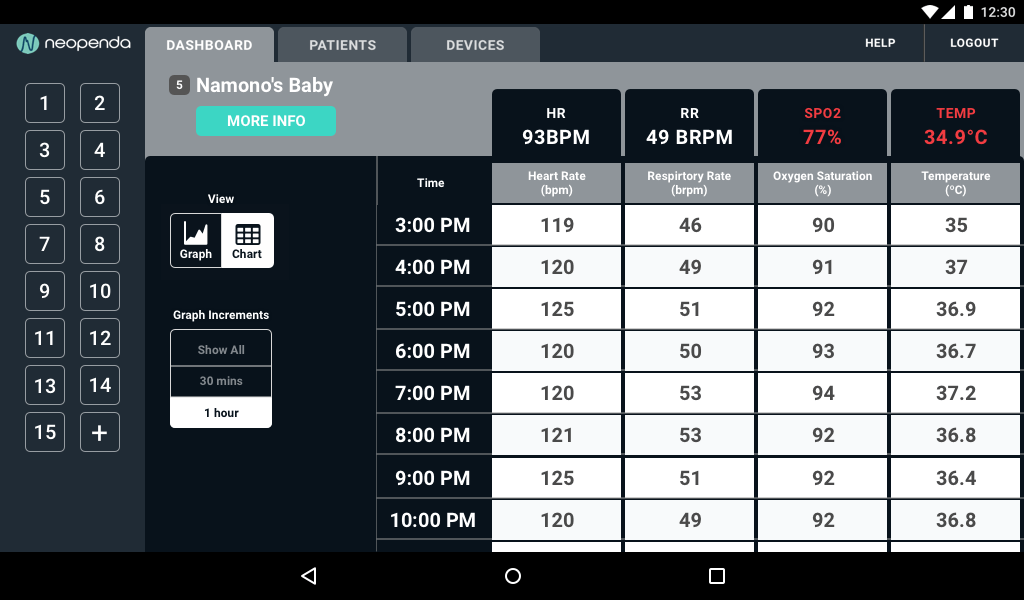
Patient Vital Chart
For a more quantitative overview, nurses can view the patient vital chart and view measurements side by side.
Usability Testing

In our final round of user testing, we focused on the usability of the interface and the effectiveness of our solution for multiple scenarios. We randomized pairs of prototypes with two different task flow options defined as “The Nurse’s Journey”. This time, we had no pool of Ugandan nurses and had to take feedback with a grain of salt.
I originally wanted to create an InVision prototype due to time constraints, but I decided to learn Framer X to be able to execute a high-level prototype that is as close to the final product as possible.

The Nurse’s Journey
A new baby named Mary was just born and left under your care, what would you do as the nurse on duty?
(Alarm #1 triggered)
What do you notice happening?
What does this mean?
How can you tell?
How will you respond?
The nurse on duty after you asks how she can see what is going on with Mary during your shift?
What do you tell her?
{Alarm #2 triggered}
What do you notice happening?
Why?
How do you know?
Prototype Walkthrough
Final Send-Offs
After the final presentation showcasing our work, I created a UI kit and comprehensive style guide to use as a tool to further develop Neopenda’s products with future designers and developers.
Next Steps

Due to the nature of the project timeline, there were other considerations that weren’t tackled throughout the sprints. These future considerations were raised to the client to further elevate the product:
- Alarm and other status changes can be explored with auditory elements.
- A key visual timer countdown would give users a better frame of time.
- A user manual for better implementation of product usage or user support.
- Consult with Ugandan nurses for proper form protocols on the Apar score.
- Further user test with Ugandan nurses to validate any future changes.
Founder’s Testimonial
“It’s been very cool to see it come all together. (We) are really excited to iterate & incorporate into the next version of our product. Beyond the UI designs, the insights you gleaned from our users were really interesting and helped us understand them better & see some things differently.
”

What I learned
It was an intensive but rewarding project where I got to hone my skills and learned about a new industry. I was able to wear multiple hats in seeing through the creative process, from conducting user interviews, to project management. I gained a better sense of designing a visual system to help users quickly adapt to the interface. Finally, I stepped out of my comfort zone and explored other prototyping tools to meet the needs of our client and users.
With my new practice in mind, I have much I would love to improve for user testing due to the time constraints between time zones with Ugandan nurses. Next time, I would try to recruit new users ahead of time when moving in agile methods. All in all, it was a great experience working with the client and my teammates. Through this design, I get to potentially save millions of lives and make an impact on this world.